Evelyn’s Crepe & Creamery: Logo Rebrand
Client: Evelyn’s Crepe & Creamery
c. 2017
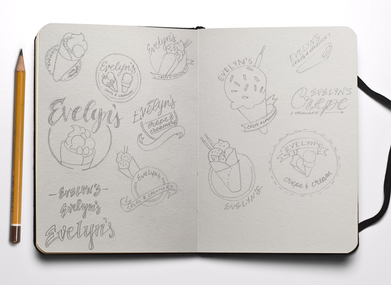
This logo was done for a small crepe cafe, located in Asia. It is specialized in crepes and ice cream. The old logo was rudimentary and did not carry on the concept that the owners would like/imagine for the brand. We were challenged to give a new identity to the company maintaining some of its nature.
The brand's new visual identity design needed to be simple, friendly, cute, lively, and above all transmit the idea that at this Crepe & Creamery everything is done with care, and zeal.
The client insisted on a few mandatory ideas, such as a round badge format, along with a banner included. So while following their suggestions I wanted to create something unique, the first step was to create workable icons.